Indivisible Santa Cruz County
Logo and Brand Refresh
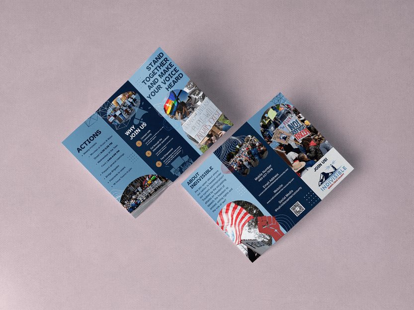
Indivisible Santa Cruz County sought a refreshed visual identity that honored its roots in the original Santa Cruz Indivisible group while better reflecting its local identity and community values. The goal was to create a logo and brand system that felt distinctly tied to Santa Cruz County, while also remaining consistent with the national Indivisible movement’s standards.
Design Mechanics
The new logo incorporated local elements—a tree, the lighthouse, and water—symbols that reflect the county’s landscape, culture, and coastal community. To maintain continuity with the larger movement, the design drew on the National Indivisible branding guide, using its approved color palette and font options. This combination of national consistency and local specificity ensured that the chapter felt both connected to a broader movement and rooted in its own community identity.
The design emphasized clean lines, modern typography, and versatile forms that could be easily adapted for use across multiple platforms, including social media, print materials, banners, and the chapter’s website.
Before / After Impact
Before the refresh, Santa Cruz Indivisible used an early logo that was serviceable but generic, offering little that tied it visually to the county or its people. The design lacked cohesion with national standards and did not stand out in a crowded political field.
After the refresh, the group gained a modern, professional, and highly adaptable visual identity. The inclusion of recognizable Santa Cruz symbols made the logo resonate more deeply with local members, while the use of national branding elements created unity across the Indivisible network. The new brand system provided a consistent, polished look that elevated the group’s credibility and visibility in the public sphere.
Narrative and Impact
In today’s crowded political landscape, grassroots groups must compete for attention against larger, well-funded organizations. The refreshed Indivisible Santa Cruz County branding gave the group a clear, recognizable identity that not only enhanced its professionalism but also fostered local pride. The design stood as both a rallying symbol and a practical communications tool—uniting national alignment with local distinctiveness.


Red October
Logo Design (Constructivist Style)
Red October is a Santa Cruz–based convergence of radical events and discussions, art, and presentations, uniting flourishing movements around a shared post-capitalist, socialist horizon. The project needed a bold, unifying mark that would immediately signal its political roots while projecting cultural energy and forward-looking solidarity.
Design Mechanics
The logo drew inspiration from the Constructivist style of the Russian Avant-Garde. Geometric forms, sharp diagonals, and strong asymmetry conveyed urgency and collective motion—key themes for a convergence dedicated to radical transformation. The traditional black-and-red palette reinforced connections to socialist and anarchist movements, while clean, modern execution allowed the logo to feel contemporary and flexible.
The typography and shapes emphasized strength and clarity, echoing historical agitational art but streamlined for digital and print applications. The design carried the visual language of revolution into the present, offering a cohesive identity that could anchor everything from posters and banners to online promotion.
Impact
Previously, Red October lacked a consistent visual identity, relying on fragmented graphics. With the new Constructivist-inspired logo, the convergence gained a powerful symbol rooted in radical lineage yet adaptable for today’s organizing. It provided both symbolic weight and practical cohesion, situating Santa Cruz activism within a broader revolutionary tradition.
*Poster in first image not designed by Amanda.
Credit goes to Neil Rudd

Women in Leadership
for Diverse Representation
Logo and Brand Design
WILDR (Women in Leadership for Diverse Representation) is a collective of women in Santa Cruz County committed to supporting and encouraging diverse women to serve in public office and leadership positions. The group provides forums for training, education, and networking while developing tools and resources to build pathways into leadership. With a clear mission to expand diverse representation in public service, WILDR needed a logo and brand identity that reflected its values of progress, inclusion, and empowerment.
Design Mechanics
The logo and brand system were designed to communicate strength, collaboration, and forward motion while maintaining an approachable and inspiring tone. Visual elements symbolized growth and connection, underscoring WILDR’s focus on mentorship and community-building. The palette drew on bold yet warm colors that conveyed energy and inclusivity, while typography balanced clarity with modernity, ensuring readability across both print and digital applications.
Consistency across the identity system—colors, fonts, and graphic treatments—created a unified look that could scale across event materials, educational resources, and online platforms. The design highlighted WILDR’s dual role: a practical resource for leadership development and a rallying point for women seeking to create systemic change.
Impact
Before the new identity, WILDR lacked a cohesive visual brand that matched the strength of its mission. The logo and brand system provided a professional, modern, and inclusive look that captured the spirit of the organization while standing out in Santa Cruz County’s civic and political landscape. The refreshed design elevated WILDR’s visibility, made its resources more recognizable, and reinforced its mission to foster progressive leadership that reflects the communities being served.
Narrative and Significance
WILDR’s new brand identity serves as more than just a visual marker—it is a call to action. The design embodies the group’s belief that diverse representation strengthens democracy, and it gives members and allies a cohesive symbol to rally behind. In a county where representation and equity are ongoing struggles, the brand positions WILDR as both a beacon of support for women leaders and a driver of systemic change.


